What is responsive design?
Responsive design is a technique which allows a website to resize depending on the size of the screen on which it is being viewed. If you resize the browser you are reading this in you will see the design adapt. If you are using a mobile or tablet then turn it 90 degrees and you will get a similar effect.
The reason why responsive design is so effective is because there are so many different screen sizes and devices that your website will be viewed on. It’s no good just having one version of your website, since people using mobiles and tablets will have difficulty viewing your site.
What’s the alternative to responsive design?
There is a variously used term called adaptive design, and this often refers to designing for mobile and creating a separate site. You may have seen sites like the BBC use m.bbc.co.uk when you view it on your mobile. This is because for older and larger sites it is much more difficult to make such a dramatic change to the design. It would be expensive to implement.
However, this is not the case on smaller or newer sites. If you are building a new site or having a redesign then ask to have it designed responsively – this will set you up extremely well for the future.
How does responsive design work?
It is actually quite a simple concept. Each screen size actually has a different design. You can’t design for every single screen size, so we created this handy table of different device’s screen resolutions. We could then decide which main sizes to design for. We also sometimes create tweaks and slight differences if needs be.
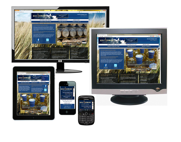
Here is an example of one of our websites, Kilchoman Distillery, from design through to finish.
So the first thing we did was layout the key pages for the five main sizes.
Here are the homepages (NB px means pixels):
Widescreen: 1920px x 1080px
(this is actually the size of most desktop screens now)
Normal: 1024px x 768px
(IE8 and under uses this size by default, but you can change this)
Narrow: 786px x 1024px
(tablets)
Large mobile: 480px x 800px
(large screen smart phones like the iPhone, HTC 1X, Samsung Galaxy I, II & III)

Small mobile: 320px x 280px
(older mobiles and Blackberry Curve, HTC Wildfire, Samsung Tocco)

We then built the mobile version first, which focuses on the building blocks of the website. The other versions then introduced the decoration. A good outcome of building in this way is that it focuses your mind on the user experience, then the design comes later.
A bit of code called a media query is used to distinguish what design should be shown for each main screen size. The media query goes into the head tag in your html. You can actually set this for any size or resolution you wish, stating the minimum and maximum resolution.
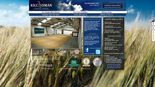
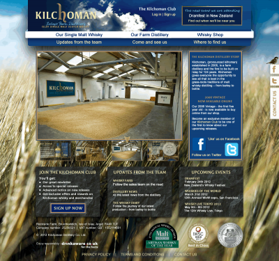
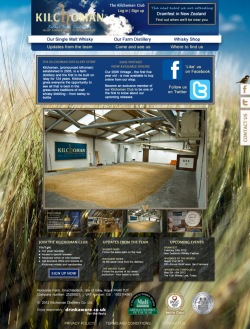
Here is the result. As you can see the final designs were developed further during the build process. You can also view the website at http://kilchomandistillery.com